Visune - Contrast Loft Diorama (INT031).6.png

analogue

12-hour calendar.

start the revolution.

the analogue 12-hour calendar is an experiment in every sense of the word. revolutionizing the modern calendar, morphing the traditional clock, and rethinking how we perceive work and scheduling. analogue is for the here, now, and everything that comes next.

keyshot

fusion

figma

illustrator

shapr3d

contributors

softwares

alex lobos

transparency, transitionally.

analogue reinterprets the traditional calendar by representing time as wedges in the hour hand, visualizing events in a familiar form as old as time itself.

analogue aims to provide as much information as possible displaying as little information as possible. the arc form of the events has been carefully designed to represent events in a visually intuitive way along the hour ring.

event priority is also represented by events being positioned closer or further away from the center of the clock, intrinsically representing their priority.

flux. flowing with you.

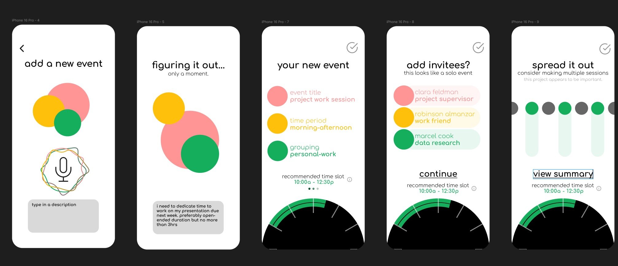
flux is the dynamic companion app to analogue, keeping track of the goings-on of your work life, social life, and personal life. preserving the original intent, flux remains as unintrusive as functionally possible.

promoting the design goal of transparency, flux’s background is formed to replicate the same clock face represented on your analogue unit, so you always know what time it is, and what’s coming up next.

flux fits into your existing calendar ecosystem, and invites additional methods of scheduling with the included nfc tag to “schedule with me”

minute Aura. glowing anywhere.

analogue is universal in many ways, including aesthetics. the minute aura provides at-a-glance information and also glows onto the walls it’s placed on, seamlessly integrating itself with its surroundings.

the minute aura, illuminated by an led ring provides quick information, such as the minutes remaining in an event and minutes remaining in a quick timer, set by turning the outer rim wheel.

the user may also turn the hour hand back to view past and upcoming events, and may quickly look ahead by swiping across the touchscreen.

processwork.

  • Rituals.

    this project originated from rituals. this ritual started with a simple question: “what’s on your desk?” with the hopes of discovering what people found necessary to bring with them to complete their work.

  • perspectives.

    people need different things in order to get their work done. i interviewed colleagues about their backpacks, desk setups, and rituals necessary to get get them at their most productive, to create a universal productivity tool.

  • thirty-five concepts.

    suffice to say, i had ideas. 35 of them. ranging from the highly functional a.k.u. modular dongle to the emotionally simple mug rack, to the intriguing calendar clock. this ritual found affiliation with 3 focuses, refining my ideation: functional, environmental, and emotional.

  • three mockups.

    three concepts made it to the final round. who reigned champion? i have a feeling you might know that. in truth, they all did. the visual experimentation of the markup calendar, the haptic functionality of the desk audio console, and the familiarity of the analogue 12-hour calendar were all present in the final product.

  • version one.

    the poker-chip inspired first clock face was primarily for a visual concept, and being able to explain that concept. the minute “ticks” and event wedges are present, though it was not initially modeled with a screen incorporated into the design.

  • version two.

    while circular displays do exist, screens with holes in the middle of them do not. to accommodate current screen technology, the hour and minute hands became hour and minute rings.

  • flux.

    the original goals of analogue demanded dynamics. naturally, “flux,” the ai-assisted companion app came to fruition.

  • version three.

    v3 introduced the new elements of the seconds display, priority-based visualization, and the short-lived previous 12 and next 12-hour displays. transparency is key, but clutter is just unnecessary.

  • glow.

    the minute leds had been completely overlooked for version two and three, and was reimagined between version three and four. a decision was to be made between the inner and outer glow rings.

  • visual overhaul.

    the previous versions of the analogue display had been too cluttered when fully populated, and the ecosystem needed to have a consistent design language.

  • version four.

    the fourth version included a simplistic seconds display and reduced text clutter. there were still issues of legibility at distance and the balance of accessibility had not been found yet.

  • the big one.

    with the interface nearly finalized, production of the prototype began. with functional constraints, fdm printing seemed to be the correct choice whilst still allowing time for final touches on figma.

  • analogue.

    screen in casing, interface finalized—the prototype was ready.


prototypes.

these demos may not function as intended on mobile.

special thanks to:

robinson almanzar :: alex lobos :: juan noguera :: chris lyons :: molly field :: gus o’brien :: bryce greigo

Previous
Previous

elihu stool - 2024